


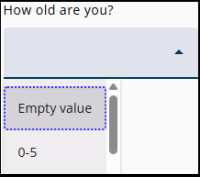
A DropDownList should be selected as the node type when only one answer can be chosen from a longer list of answers. This type of question is called a closed question, as only a limited set of answers is available.
For a short list of options, a RadioButtonList node is recommended. If multiple options can be selected, a CheckboxList node should be used.
Settings
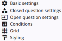
A DropDownlist node includes several common settings that are shared across most other node types, providing consistent functionality and configuration options.
The specific closed question settings are described in the following section, and detailed information about the common settings can be found below.
Closed question settings
Information about closed question settings is provided in the article listed below. Details on categories, including how to add them manually in the Closed Question settings panel or via the Category Builder (a tool for managing categories), are also included.
 | Closed question settings Read more about the closed question settings. |
 | Category details Read more about categories and how to add these. |
 | Adding categories Adding categories, e.g., with the Category builder. |
Open question settings
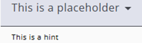
This pangel contains two settings for the drop-down list, they are described in the table below.
| Setting | Description |
| Placeholder | Text displayed in the dropdown, which disappears when a selection is made. |
| Hint | Enter a brief description of the expected answer (up to two lines). This text will appear below the input field. |
Other settings
Click the links below to explore these settings. The Tags and Trigger tabs are not included here, as they provide advanced functionality and are outside the scope of this guide.
 | Basic settings Learn more about the basic settings of a node. |
 | Conditions Learn how to add conditions to nodes. |
 | Grid Read more about the column layout, breakppoints, and more. |
 | Styling Discover how to style the node. |
 | Validations Read more about how to add validations. |
 | Translations Read more about adding translations. |