


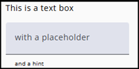
Select Textbox as the node type when the respondent needs to enter a short text, such as a city name.
For longer texts, use a Textarea.
Settings
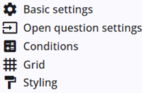
A Textbox node includes several common settings that are shared across most other node types, providing consistent functionality and configuration options.
The specific Textbox settings are described in the following section, and detailed information about the common settings can be found below.
Open question settings
In addition to the common settings, the Textbox node also includes specific settings.
| Setting | Description |
| Alignment answer text | Sets the text alignment (left or right). |
| Show prefix | Displays a small text or icon before the answer, for example http:// when a URL is required. |
| Show suffix | Displays a small text or icon after the answer, for example a file extension such as pdf. |
| Mask | Useful when the answer must follow a specific format, such as a telephone number. |
| Show the mask while typing | The mask will be displayed immediately and kept visible while typing. |
| Delete special characters during saving | Special characters, such as a dash, are not saved when this option is enabled. |
| Placeholder | Adds a placeholder to the text area to provide additional information to the respondent. |
| Hint text | Adds a small hint text below the text area to provide additional information to the respondent. |
Other settings
Click the links below to explore these settings. The Tags and Trigger tabs are not included here, as they provide advanced functionality and are outside the scope of this guide.
 | Basic settings Learn more about the basic settings of a node. |
 | Conditions Learn how to add conditions to nodes. |
 | Grid Read more about the column layout, breakppoints, and more. |
 | Styling Discover how to style the node. |
 | Validations Read more about how to add validations. |
 | Translations Read more about adding translations. |