


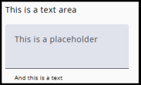
Select Textarea as the node type when the respondent needs to enter a large texts, such as a comments.
For shorter texts, use a Textbox.
Settings
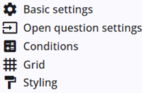
A Textarea node includes several common settings that are shared across most other node types, providing consistent functionality and configuration options.
The specific Textarea settings are described in the following section, and detailed information about the common settings can be found below.
Open question settings
In addition to the common settings, the Textarea node also includes specific settings.
| Setting | Description |
| Maximum number of lines in the text area | A scrollbar appears when the number of lines exceeds this limit. Until then, the text area automatically expands. |
| Minimum number of lines in the text area | The initial height of the text area, measured in row. |
| Placeholder | Adds a placeholder to the text area to provide additional information to the respondent. |
| Hint text | Adds a small hint text below the text area to provide additional information to the respondent. |
Other settings
Click the links below to explore these settings. The Tags and Trigger tabs are not included here, as they provide advanced functionality and are outside the scope of this guide.
 | Basic settings Learn more about the basic settings of a node. |
 | Conditions Learn how to add conditions to nodes. |
 | Grid Read more about the column layout, breakppoints, and more. |
 | Styling Discover how to style the node. |
 | Validations Read more about how to add validations. |
 | Translations Read more about adding translations. |