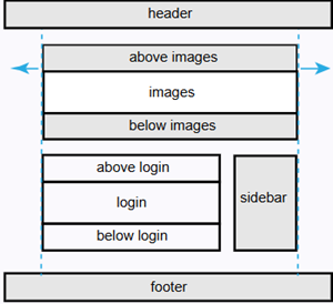
The login page can be enriched with images and text. It is therefore (virtually) divided into several sections where content can be added.
The image on the left shows these sections, which are described in more detail below.
The header and footer sections are not covered here, as they are configured in the Layout tab of the questionnaire. The login component is also not described, as it simply provides the field for entering the start code.
Page settings
The table below describes the different page settings.
Setting
Description
The maximum width of the page
Defines the maximum width of the page relative to the questionnaire width (Full, Large, Medium, or Small).
Aligment of the login component
Determines the horizontal alignment of the login component within the available space.
Alternative login header text
Overrides the default header text displayed on the login page.
Above and below the images components
These two components share the same properties and are therefore described together here.
Setting
Description
Above/below images
When enabled, this component is displayed on the login page.
Text above/below images section
Defines the text displayed in this component.
Background colour
Sets the background colour of the component.
Images component
Setting
Description
Select images
Opens the media library to select images.
Scaling images
Under construction.
Max height
Sets the maximum height of the image(s) in pixels. Set to 0 to remove the height limit.
Above the login component
Setting
Description
Above the login component
When enabled, this component is displayed on the login page.
Text above the login section
Defines the text displayed in this component.
Background colour
Sets the background colour of the component.
Below the login component
Setting
Description
Below the login component
When enabled, this component is displayed on the login page.
Text below the login section
Defines the text displayed in this component.
Sidebar component
Setting
Description
Sidebar
When enabled, this component is displayed on the login page.
Sidebar location
Sets the position of the sidebar relative to the login component (left or right).
Sidebar location on a small device
Defines the position of the sidebar on small devices (above login, below login, or below content).