


An Area chart is useful for visualizing trends over time, showing how values change and accumulate across a period (see the example below).
It is often used to track the progress of completed cases and to evaluate the effectiveness of reminders. To configure such a chart, use the response end date as the primary variable and the response status as the secondary variable, while hiding the non-completed cases.
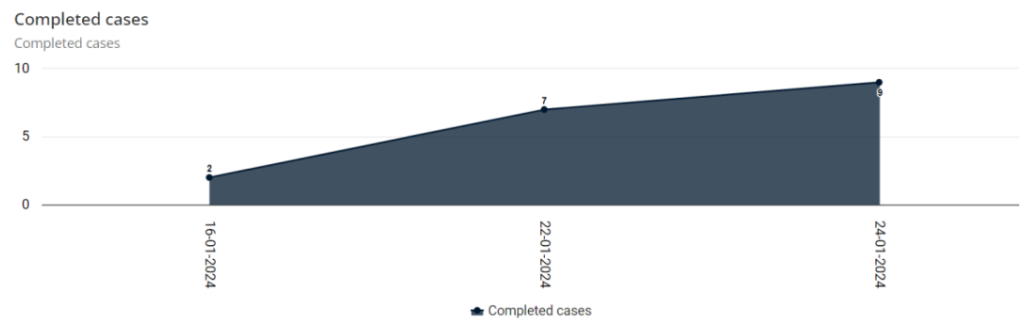
Creating a Area column chart
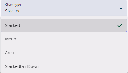
Click the Add widget type icon and select Chart as the widget type. A message will appear indicating that the stacked column chart is the default chart.
After the widget has been saved, the chart type can be changed in the Basic settings panel. See the section below for more information.
Settings
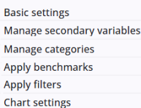
A Area chart widget includes several common settings that are shared across most other widgets, providing consistent functionality and configuration options.
The specific Area chart settings are described in the following section, and more information about the other settings can be found here.
Area Chart settings
The Area chart widget has several specific settings, accessible through the Chart settings panel. These are listed and explained below in separate tables. Some of them may also apply to other chart types.
General chart settings
Set the title and some other general settings here.
| Setting | Description |
| Subtitle | A title above the chart, below the question text. |
| Height | Adjust the height of the chart. If no height is specified, it defaults to 400 pixels. |
| Show export | A small menu at the right top of the chart offering export to Excel and more options. |
| Decimals | Number of decimals |
Colours
Set the colours of the bars of the chart here.
| Setting | Description |
| Use colour range | When enabled, a colour range can be set. The range is transformed into a spectrum based on the number of categories. |
| Add colour to range | Set the initial colours of the range and add extra colours if needed. The colour pickers shown below can be used to define the start and end colours. |
Legend
Define the horizontal en vertical legends here.
| Setting | Description |
| Position legend | The horizontal legend can be positioned either Left, Center, or Right. |
| Vertical position legend | The vertical legend can be positioned either Top, Middle, or Bottom. |
| Legend offset | The x and y offsets of the horizontal legend are defined here. |
| Legend layout | Specifies how the legend items are aligned, either horizontally or vertically. |
| Legend Label format | The text displayed in the legend. Using {name} inserts the category name for each legend item. |
Tooltip
Define the tooltip of the chart here.
| Setting | Description |
| Enable tooltip | The chart data tooltip can be enabled or disabled. When enabled, formatting options become visible. |
| Header format | Top part of the tooltip (optional). |
| Point format | Center part of the tooltip (optional). |
| Footer format | Bottom part of the tooltip (optional). |
Y-axis
The title and the position of the vertical axis.
| Setting | Description |
| Y-axis title | The title of the Y-axis. |
| Vertical position title | The vertical position of the title, either Top, Middle or Bottom. |
Export menu
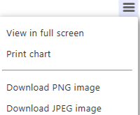
Each chart includes a small menu in the upper-right corner above it, offering several options.
The chart can be printed, or downloaded in formats such as an image or a CSV file (not shown in the image).