


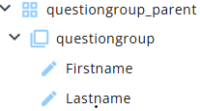
A Grid can be used to group multiple nodes within a single report. The text and corresponding answers are displayed in two columns within an expandable panel.
This article describes how grids can be used and configured in reports.
Settings
Several properties, such as Name and Text, are common to all node types. A detailed article describing these common settings can be found at the end. The remaining settings are described below.
| Setting | Description |
| Indent | Displays the grid node with an indent when enabled. |
| Show grid borders | Displays grid borders when enabled. |
| Column width | Defines the column width mode: Auto, Equal, or Custom. |
| Left column width | (When Custom column width is selected) Sets the left column width. The total page width is 600 pixels; the right column width is calculated automatically. |
| Column header left text | Sets the header text for the left column. |
| Column header right text | Sets the header text for the right column. |
| Toggle children | Enables an expand/collapse option for child nodes. If Toggle children is already enabled at the Report node, this setting will be active by default. |
| Expanded | If Toggle children is enabled, this toggle expands the children by default. |
| Avoid page breaks inside | Prevents page breaks within the grid content when printing. When enabled, the grid starts on a new page if needed. |
| Background colour | Sets the background colour of the node. |
| Background colour only on single column rows | Applies the background colour only to single-column rows (rows that are not questions). |
Other settings
Click the link below to explore these settings.
 | Common settings Learn more about the common settings of a node. |