


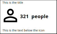
The platform’s icon set can be used to create infographics by displaying icons next to variable outcomes.
Icons can be customized in size, colour, position relative to text, as well as with prefixes, suffixes, titles, and labels.
Settings
An Icon widget has several settings, which are described in this section. For all settings: press the Save button to make the changes permanent.
Widget name
The first setting after clicking the widget in the list of widgets is the Widget name. It can be changed here—choose a clear name so it can be easily found later.
Icon
The following table describes the Icon settings, including size and type.
| Setting | Description |
| Type | Choose between Icon or Image. Icon lets the user select from a large list of Google icons, while Image allows the user to choose an image from the image bank. |
| Choose icon | If Icon is selected as the type, clicking this button opens a window to select and configure an icon. Use the link to the icon list to choose an icon. The icon name should follow the Material Design Icon naming, e.g., check_circle. |
| Select image | Clicking this button opens the image bank to select an image. |
| Icon size | Sets the size of the icon in pixels. |
Variable
A variable must be chosen when the Icon widget is created. It can be changed in this section and configured in the way that best fits the report.
| Setting | Description |
| Variable | The variable selected when the widget was created. It can be changed here by clicking the Edit icon. |
| Category | The category used to display the variable value. |
| Variable text size | The text size of the variable value, in pixels. |
| Variable prefix | Optional text displayed before the variable value, such as a currency symbol. |
| Variable suffix | Optional text displayed after the variable value, such as students. |
| Variable alignment | The position of the variable value relative to the icon. Options are left, right, below, or above. |
Apply benchmarks
This documentation is under construction.
Title and text
| Setting | Description |
| Title | Optional title displayed above the icon, variable, and text. |
| Text | Optional text displayed next to or below the icon and variable. |
| Text alignment | Alignment of the text relative to the icon and variable. |