


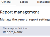
This article provides an overview of the general settings of a report node, such as its name, title, and other attributes. Most of these settings are straightforward, and guidance is provided by the Single Reports Editor through help texts.
The table below lists all options, along with brief descriptions.
Settings
The tables below present the settings, organized into separate sections for clarity. The first table covers the general settings. The header and footer settings are displayed separately below this table.
| Setting | Description |
| Name report definition | Enter a clear name for the report to make it easy to locate later. |
| Browser title | The title displayed in the browser. Translation keys (e.g., {{t._title}}) can also be used. |
| Availability period | The number of days the report is available (e.g., 365 days). |
| File name | Name of the downloaded PDF file. If left empty, the file will be named something like filename-20260403_110846.pdf.’ Variables such as labels or translations can be used. |
| Show front page | Enables the addition of a front page when toggled on. |
| Layout | Layout options |
| Basic column layout | Sets the grid layout (max 12 columns), divided into question and answer columns. |
| Margins | Sets vertical and horizontal margins in pixels. |
| Font size | Choose between Smaller, Normal, or Larger. |
| Distance betwen questions | Choose between Smaller, Normal, or Larger. |
| Toggle children | Controls whether child nodes are expandable by default. If disabled, this setting can be overridden at the grid or range level, allowing flexibility for specific sections. When enabled, however, all child nodes will always be expandable, and the setting cannot be overridden. |
| Expanded | When Toggle children is enabled, the children can be set to be expanded by default. |
| Chart options | |
| Add colour to range | Set the initial colours of the range and add extra colours if needed. The range is automatically transformed into a color spectrum based on the number of categories. The colour pickers shown below can be used to define the start and end colors. |
| At the bottom | |
| Chips colour | Determines whether answers are displayed in chips or as plain text. |
| Report functions | Expression functions that can be used in the report, e.g., Sum. Click the calculator icon to open the expression editor. |
| Custom CSS | Apply any CSS rule to existing HTML elements (e.g., give the header a black background). |
The header settings
| Setting | Description |
| Show start code | Displays the start code in the header when enabled. |
| Show date of completion | Displays the completion date in the header when enabled. |
| Header text | The text that appears in the header. |
| Selected media | Opens the image bank to select an image, which will be shown in the header. |
| Edit/remove | Either change the selected image or remove it. |
| Header image position | Sets the image position in the header: Left or Right. |
| Header colour | Sets the background colour of the header. |
The footer settings
| Setting | Description |
| Show page numbers | Displays page numbers in the footer when enabled. |
| Footer text | The text that appears in the footer. |
| Selected media | Opens the image bank to select an image, which will be shown in the footer. |
| Edit/remove | Either change the selected image or remove it. |
| Delete image | Removes the currently selected header image. |
| Footer image position | Sets the image position in the footer: Left or Right. |
| Footer colour | Sets the background colour of the footer. |