


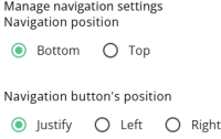
This article describes the settings for the navigation buttons, including options such as their position, colour, and appearance.
In most cases, two navigation buttons are displayed: Previous and Next, allowing respondents to move backward and forward.
Depending on the configuration, a Validate button may also be displayed alongside the Previous and Next buttons when Allow navigation on validation errors is enabled.
Settings
The table below explains the navigation settings.
| Setting | Description |
| Navigation position | Sets the vertical position of the navigation bar (top or bottom). |
| Navigation button’s position | Sets the horizontal alignment of the navigation buttons (justify, left, or right). |
| Background colour | Sets the background colour of the navigation bar. |
| Next button colour | Sets the colour of the Next button to either Primary or Accent. |
| Previous button colour | Sets the colour of the Previous button to either Primary or Accent. |
| Hide Previous button | When enabled, the user cannot navigate back in the questionnaire. |
| Allow navigation on validation errors | This option allows navigation even when validation errors (such as missing required fields) are present. It is intended for use with complex structures, such as menu items that require validation at the submenu level. If enabled without such configurations, respondents may skip required questions, which can result in incomplete or lost data. |
| Extra classes | Allows additional CSS class names. Custom CSS can be added via questionnaire settings (e.g. extra bottom padding). |