


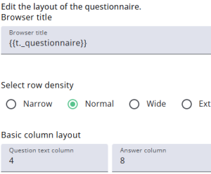
In this article, the different layout settings of the questionnaire are explained.
The available options range from the configuration of the title, to line height, spacing, and the number of columns in which questions and content are displayed. By adjusting these settings, readability and layout can be optimized.
It should be noted that many individual question types also have their own styling options.
Settings
The following tables describes the Layout settings, the header and footer settings are described in a separate table.
| Setting | Description |
| Browser title | This is the title that is displayed in the browser. A translation key, such as {{t._title}}, can also be used. |
| Select row density | Choose between Narrow, Normal, Wide, or Extra wide. |
| Basic column layout | Sets the grid layout (max 12 columns) divided into question and answer columns. |
| Select a breakpoint | Sets the screen width at which questions and answers switch from horizontal to vertical. |
| Value for small screen | Defines the pixel value below which isSmallScreen is true. Can be used to show different instructions on small screens. |
| Enable auto-forward | Automatically continue to the next page when all questions are answered without errors or warnings (applies only to radiobuttons). |
| Amount of milliseconds | Sets the delay for auto-forwarding. |
| Auto forward mode | Choose Selected nodes (enabled on the node itself) or All nodes (individual nodes can be excluded). |
| Enable auto-forward for desktop | Enable auto-forward on desktop when active. |
| Delay for automatically forwarding the respondent after completion | Sets the wait before automatically forwarding the respondent when a single link is available. Leave empty or 0 to disable. |
| Turn on speech function for | Enables the speech function for all nodes, selected nodes, or no nodes. |
| Default status speech function | Sets whether speech is enabled when the questionnaire is first opened. Header required. Not for respondents; for testers, applies only once per browser session. |
| Hide asterisk for mandatory questions | Removes the asterisk from mandatory questions. |
| Show only a warning text when there are warnings on the page | Hides question names when warnings are present. Only one warning (_warningNotAllQuestionsFilled) is displayed. |
| Warning message text colour | Sets the colour of warning messages below question fields: Black, Blue, or same as error messages. |
| Custom CSS | Apply any CSS rule to existing HTML elements (e.g., give the header a black background). |
Header settings
The header contains several settings, some of which relate to digital accessibility.
| Header setting | Description |
| Header | Enables or disables the header. |
| Extra space above and below | Controls the vertical spacing (padding) of the header. |
| Header colour | Sets the background colour of the header. |
| Header text | The text displayed in the header. |
| Dark mode option | Enables the dark mode option in the survey. |
| Increase/decrease font size option | Enables the option to increase or decrease the font size in the survey. |
| Pause questionnaire option | Enables the pause button in the survey. |
| Enable dislexic font | Enables the dislexic button in the survey. |
| Images | Enables the images block in the Survey Editor, allowing images (including background images) to be uploaded. |
| Add images | The media library is opened to select an image. A Dark mode image can be set by clicking the image that is automatically added when an image is selected. The Edit button can be used to specify the Alt text for the image. |
| Alignment of image(s) | Sets the position of the images: left, right next to the title, or right next to the menu. |
| Image size | Sets the image size: Auto-fit,Original or Scale. |
| Image scale | (only available when Image size is set to Scale). The maximum zoom level of the image within the available space can be specified. |
| Background image | Enables the background image option in the Survey Editor. |
| Select image | Opens the media library to select a background image. |
Footer settings
The footer has only a few settings.
| Footer setting | Description |
| Footer | Enables or disables the footer. |
| Extra space above and below | Controls the vertical spacing (padding) of the footer. |
| Colour | Sets the background colour of the footer. |
| Footer text | The text displayed in the footer. |
| Menu | Enables or disables the menu. Read more |
| Menu position | Sets the position of the menu: left, center, or right. |