


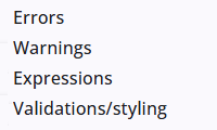
The Validation panel provides options to configure errors and warnings, such as the Error when not answered error.
The available type of errors and warnings may vary depending on the node type. The list below shows all available options across all node types.
Default error and warning messages can be translated and are available in multiple languages. Custom messages can be added, but these cannot currently be translated.
Errors
There are some differences in the possible errors between node types. All errors, along with any additional fields such as messages, are listed below, including the node types to which they apply.
| Error/field | Description |
| All except CheckboxList | |
| Error when not answered | When enabled, the field is required. |
| Custom error message | Defines a custom error message for the Error when not answered setting. |
| Node type Number | |
| Number of digits | The number of digits, excluding the minus sign and decimal places. A value of 2 allows numbers from 10 to 99. |
| Range error (min – max values) | The number must be between the minimum and maximum, inclusive (min ≤ number ≤ max). |
| Custom error message | Defines a custom error message for the range setting. |
| Node type TextBox and Textarea | |
| Valid email address | The entered value needs to be a valid email address. |
| Customer error message | Defines a custom error message for the email check. |
| Maximum number of words | The maximum number of words that can be entered. |
| Minimum/maximum number of characters | The minimum and maximum number of characters that can be entered. |
| Node type Date | |
| Date range | Select a start and end date using the date picker, or type the dates. It is also possible to enter only a minimum of maximum date. |
| Sliding date range backwards + unit | Defines the maximum number of days, weeks, or years before the current date that can be selected. |
| Sliding date range forwards + unit | Defines the maximum number of days, weeks, or years after the current date that can be selected. |
| Node type CheckboxList | |
| At least one answer | Requires the user to select at least one option. |
| Custom error message | Sets the error message shown when no option is selected. |
| Maximum number of answers | Limits how many options the user can select. |
| Custom error message | Sets the error message shown when the selection exceeds the allowed maximum. |
Warnings
Some checks appear in both the warnings list and the error table above. Warnings can be ignored, whereas errors cannot.
| Error/field | Description |
| Warning when not answered | When enabled, the users gets a warning when the question has not been answered. |
| Custom warning message | Defines a custom warning message for the Warning when not answered setting. |
| Node type Number | |
| Range warning (min – max values) | The number should be between the minimum and maximum, inclusive (min ≤ number ≤ max). |
| Custom warning message | Defines a custom warning message for the range setting. |
Expressions
Custom expressions can be defined for validations, which is useful when the standard error and warning checks are not sufficient.
Below is an example of an error and a warning expression. It checks the value of the question number: the first line returns an error, and the second line returns a warning. The messages can also be replaced with a dictionary item, which can be made available in multiple languages.
errorExpr(q.number.value == null || q.number.value === 0, 'The value is zero/empty')

warningExpr(q.number.value != null && q.number.value > 10, 'The value is large')
Validations/styling
Validations
In the last section of the validation settings, the timing of field validation is controlled. By default, fields on the screen are not validated until the Next or Previous button is clicked. After one of these buttons is used, it can be specified whether validation is performed while typing in the field or when the field is left.
Styling
The display of hint and error messages is determined by this setting. Space can be reserved in the form field for one line of hint or error text with a fixed height, or the spacing can be allowed to grow dynamically from 0 px depending on the length of the hint or error message.