


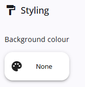
The Styling panel provides options for configuring the width, background colour, and other visual settings.
The options available in the styling tab may vary depending on the node type.
The table below displays all possible styling options across all node types.
| Setting | Description |
| Colour | Defines the background colour. |
| Width | The options are Default, 25%, 50%, 75%, 100%, and Custom. When Custom is selected, a field appears to enter the width in pixels. |
| Custom width | Specifies the custom width of the node in pixels. |
| Maximum width | Defines the maximum width of the node. |
| Class names | Additional CSS class names can be specified, separated by commas. |
| Show borders | (only for RadiobuttonList) When enabled, a border is added around the categories and a light background is applied to improve visual clarity and presentation. |
| Division line | (only for NodeInfo) Can be set to Above, Below, or None (default). |